ADF: Responsive UIs using af:matchMediaBehavior
This is not a new component as it was released with version 12.2.1 back in November but it deserves a mention as it allows us to easily create responsive user interfaces. Although we were able to define media queries in our css and skin files, this component allows us to change component properties according to the screen size.
This component has 3 properties to look at:
- propertyName: Name of the property we want to change
- matchedPropertyValue: New value of the property
- mediaQuery: Here we can set the condition by defining a CSS media query. You can learn more about it here: CSS Media Queries
In this example I am going to use a simple form based on Employees view object from HR Schema.
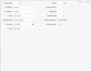
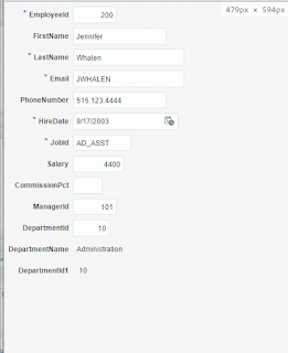
We are going to change the number of rows of the panelFormLayout to 7 when the screen with is less than 900px and we will change it to 15 if the with is less than 750px.
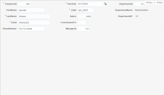
As you can see by default the form is displayed like this:
If we make the screen smaller we can see that the layout is changing (you can see the with of the screen at the top right corner of the images)


2 Comments
Muhammad Shehzad
November 12, 2018
working fine on my desktop browser window.
not working in my mobile browser window
Muhammad Shehzad
November 12, 2018
this will work fine as u mentioned in my desktop browser window.
No working to rows=15 while opening in mobile browser window